Keeping the user in the room
Everyone at CHG is building faster now that AI makes it cheap. The risk is that we start designing for what's easy to build and quietly forget who we're building for. So I took one real person, a first-time locums provider, and turned his whole journey into a page you can scroll through. It doubles as a starting point we can reuse for our other personas.
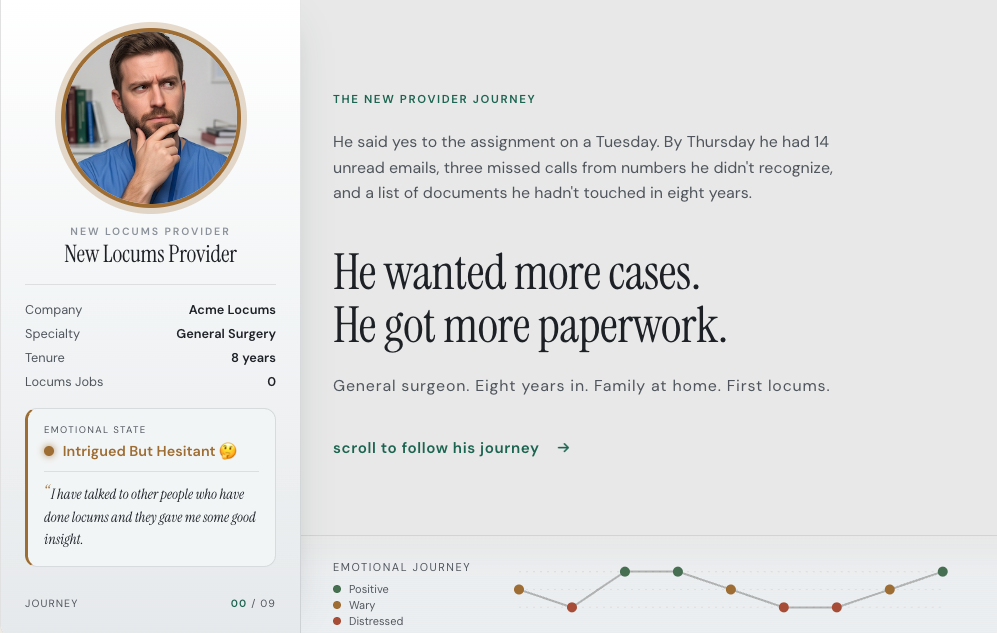
The journey beginning. Scroll to move through nine stages; the sidebar tracks his emotional state, the line at the bottom is the whole arc at a glance.
AI has made building cheap. A PM can prototype something over lunch, and an engineer can ship the flow the same afternoon. That speed is mostly a good thing. The catch is that when anything is easy to build, the conversation slides toward what we can build, and the actual person we're building for gets fuzzy. Everyone nods along about "the user" and no one can quite picture them.
I wanted one real person back at the center of it. Someone a team could follow through his whole day, with a face and a mood, not a headshot and three bullet points. I picked a first-time locums provider: a surgeon, eight years in, who says yes to his first locums job and then finds out how much paperwork that yes actually costs him.
How do you keep one real person in view when the whole team is moving this fast?
A normal persona is one page. A photo, a few bullets, a made-up quote. Handy in a workshop and forgotten by Friday. His real journey doesn't fit on a page. It runs nine stages, and each one has its own work to do, its own friction, and a different feeling attached to it.
So I made it something you scroll through sideways. He sits in a fixed sidebar and comes along with you. As you move from his first awareness through credentialing, travel, and the job itself, his photo and his mood shift to match where he is, and his own words show up next to him. Each stage lays out what he's trying to do, where it goes wrong, and what could fix it. All of that is just content in a list, so the same layout can hold the next persona too.
A persona earns its keep by being the thing you actually leave open while you work.
Most personas die because opening them is a chore. If checking in on the user takes one link and about thirty seconds, people actually do it, even in a busy week. If it means digging a PDF out of a shared drive, it goes stale the day after the workshop.
I built it as a plain HTML page you scroll, on purpose. Pages like this are cheap to make now and easy to host, so it can sit on our internal customer-intelligence platform as a real link instead of an attachment. Anyone can open it. A VP skimming before a meeting and an engineer scoping a feature end up looking at the same person.
Lives at a link
It's a page on the platform, so you can drop the link in Slack or embed it in a doc.
Works for everyone
A VP skimming before a meeting and an engineer scoping a feature come away with the same picture.
Shows the feeling
The sidebar tracks how he feels at each step, and one line along the bottom shows the whole ride. You can see the dip at credentialing.
Easy to keep current
Each stage is just content in a list. Change the journey and the page redraws itself, with no redesign or re-export.
Cheap to add to
The next persona is mostly new writing in the same layout, so it's a small job rather than a new project.
Quiet on purpose
The design stays out of the way, so he's the thing you notice and not the interface around him.
I kept the look quiet. A cool, light palette that feels right for healthcare, a dark slate for text instead of black, and a serif used only for the human bits like his quotes and the headlines, with a plain sans for everything else. Color does a job here rather than decoration. The mood colors belong to him and his emotional arc. The cards themselves only ever use two: a warm tone for pain points and green for opportunities. Read one card and you can read them all.
The first version gave him a little SVG cartoon face that changed expression with his mood, a smile or a frown drawn in code. It was a fun trick and it worked, but he still read as a graphic. Your eye treated him like part of the interface.
Then I swapped in real photos, one per stage, each matched to how he's feeling. The hand on the chin while he's weighing it up. The hand on the forehead when the calls and emails start piling on. The worn-out stare by the time he's traveling. The quiet relief at the end. The moment his face got real, the whole thing felt different. Same content, same layout, but now someone is actually looking back at you.
His expression is set by the code, so he looks like part of the interface.

Nine real photos, one for each stage, matched to how he's feeling.
Same content, same layout. The real face is what made him feel like a person you'd want to help.
I showed it to the team and it got better fast. They fixed and filled in the journey with what they actually knew: stages that were off, pain I'd underrated, wording that wasn't quite right. That's the whole point of a page like this. Fixing it is easy in a way that fixing a slide deck never is.
The best note had nothing to do with accuracy. The journey ended on him, satisfied and a little worn out and done. Someone said it shouldn't end on him, it should end on us. Add a last step that takes all his friction and turns it into a question for the team. So now it closes on a "where do we go from here" screen, with a short recap and a few "how might we" prompts to get people thinking about what to do next.
The version that stuck was the one that asked the team a question, instead of just handing it information.
The locums provider was always the first one, with others to follow. Since the layout just takes content, building the next persona is mostly a writing job rather than a design one.
Make the first one reusable Done
The stages, sidebar, arc, and closing screen are now a structure I can pour new content into. The next persona doesn't need a fresh build.
Add the other personas Next
Use AI to rough out the journeys for our other key personas in the same layout, then sharpen them with the teams who know those users best. It's the same loop that improved this one.
Give them a home on the platform Next
A small set of personas on the customer-intelligence platform that anyone can open or link to, so there's an obvious place to go when you want to remember who you're building for.
Keep them current Ongoing
Personas go stale as the product changes. If each one has an owner and stays easy to edit, it keeps being worth trusting.
Build fast. Just keep one real person scrolling along beside you while you do.