The commute, hour by hour
26 million Bluebikes trips across seven years. A scrollable, scrubbable map of how Boston moves by bike.
Bluebikes publishes its trip data every month: start station, end station, timestamp, member type. The archive goes back to 2019. I downloaded all of it, 91 months of CSVs, and started asking what it would take to make 26 million rows feel like something you could browse in a tab.
There was no brief and no stakeholder. I just wanted to see if I could make the data browsable.
The site has three tabs. Hour of Day lets you scrub across 24 hours and watch commute patterns shift: quiet at 3 AM, packed at 8, a second wave around 5 PM. Eras compares three snapshots (pre-pandemic, the April 2020 crater, and today's record network). Reach shows where the system doubled and where it barely grew.
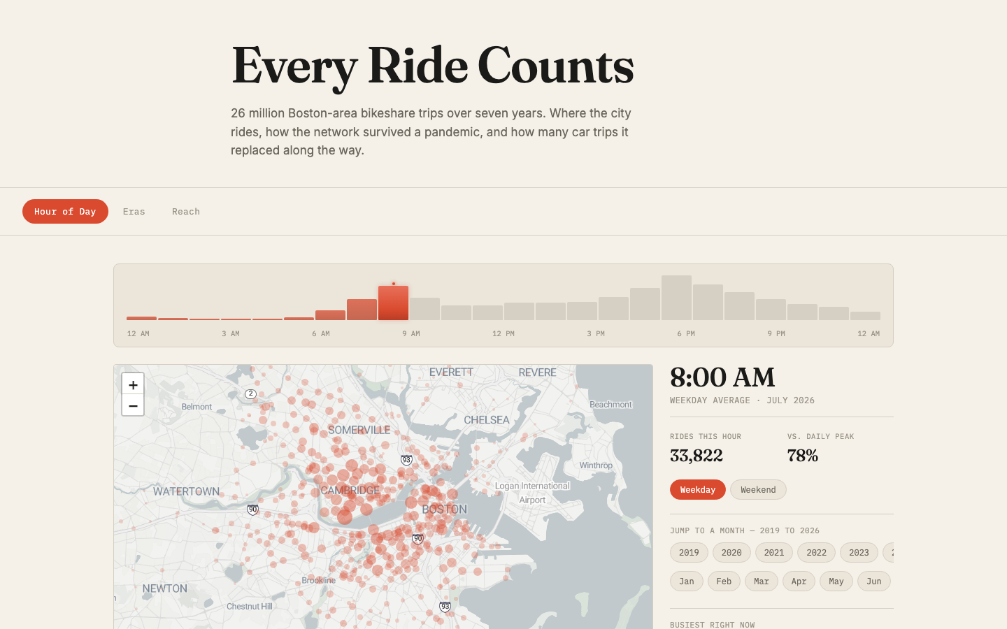
Hourly view at 8 AM, July 2026. Scrub the waveform to move through the day; pick a year and month to compare across seven years.
Each month's CSV gets downloaded, processed into a lightweight JSON file (station coordinates, hourly departure counts, trip stats), and dropped into a folder. The page lazy-loads one month at a time and caches what it's already fetched. The whole archive is about 12 MB, but the browser only touches the slice you're looking at.
The harder design decision was normalization. If each month scales its own bubbles, April 2020 looks just as "full" as July 2026, which is a lie. Every bubble in the site is sized against the single busiest station-hour across all 91 months, so quiet months actually look quiet and record months look packed. Getting that right was most of the work.
The first version was called "Who Gets to Ride." The equity angle was real and the data supported it, but the framing was accusatory. It pointed at gaps without offering anything, and the whole thing read more like an indictment than an exploration.
The second version asked a different question: what's the environmental impact of all these rides? I read through eight papers on bikeshare car-trip substitution, from Fishman's 2015 meta-analysis to Wang et al.'s 2025 multi-city study. The research puts the substitution rate at 30 to 35%. Applied to the Bluebikes dataset, that's roughly 5,000 metric tons of CO2 and 12 to 14 million car-miles off Boston streets since 2019.
The equity data stayed (it's the Reach tab), but the tone softened. The title became "Every Ride Counts," and the framing moved toward what the system has done rather than what it hasn't.
The first palette was green-on-black. It looked like a data dashboard, which made sense technically but felt wrong next to the editorial tone of the copy. The words were doing magazine, the colors were doing terminal.
I flipped to a warm cream background with coral accents and light Stadia map tiles. The map blends with the page instead of punching a dark hole in it, and the coral dots are saturated enough to read against the light street grid. It reads as one surface instead of a page with a dark rectangle dropped into it.